4.3.2. Polars examples
Dataframes provide a way of representing tabular data in Python, for example the kind of data that you might have analyzed in Excel previously. We’ll look at two different types of data here:
Data stored in an Excel spreadsheet. We’ll use student marks as an example that you’ll be familiar with, but you’ve probably used spreadsheets for storing lots of different types of data previously. Here we can use polars and Python to give a repeatable, code based, analysis that can be run, and re-run on multiple different spreadsheets, and produce high quality graphs.
Timeseries data. These might be recordings from sensors in an experiment, or an oscilloscope in the lab. Like in Lab E we’ll generate some synthetic data, and put this into a dataframe, but we could equally load in data from an external
.mator.csvfile or similar.
Also, we’ll run this file interactively. That is, we wont’ use an if __name__ == "__main__": block, but instead put everything in the global scope. We covered this in Lab B. This style is quite common with data science type programmers. We’re going to use it here as it means we can use the Jupyter variable explorer to see the contents of the dataframe, which is useful when just starting out as the debugger doesn’t have as good a way of visualizing dataframes yet.
Note
In the below you’ll see we’ve hard coded the column names. This is to make the examples more readable. In practice, you might want to put the column names into variables to minimize the chances of a typo meaning part of the code uses a wrong column.
4.3.2.1. Tabular data
4.3.2.1.1. Loading data from Excel
Click here to download an Excel spreadsheet containing student marks for two courses. Save it in your Lab F data folder. You can ignore any
marks.xlsxfile that is already in the folder.This Excel spreadsheet contains the same marks as we used in the first part of the lab, but stored in a more helpful format. (Usually we want to separate out data from code, rather than hardcoding data into the code itself.) It also contains a few more columns.
Make a new Python file with any suitable name, and add the code below to this.
import pathlib
from os.path import join as pjoin

import polars as pl

# Set file to load
script_folder = pathlib.Path(__file__).parent.resolve()
data_dir_from_script_folder = pjoin(script_folder, "../", "data")
xls_fname = pjoin(data_dir_from_script_folder, "marks.xlsx")

# Load data
df = pl.read_excel(xls_fname)
Just
pl.read_excel()is actually loading the data into a dataframe. The rest of the code is just to find the correct path to the data file.Run this code interactively. That is, click on the down arrow next to the
Runbutton in VSCode and selectRun Current File in Interactive Window.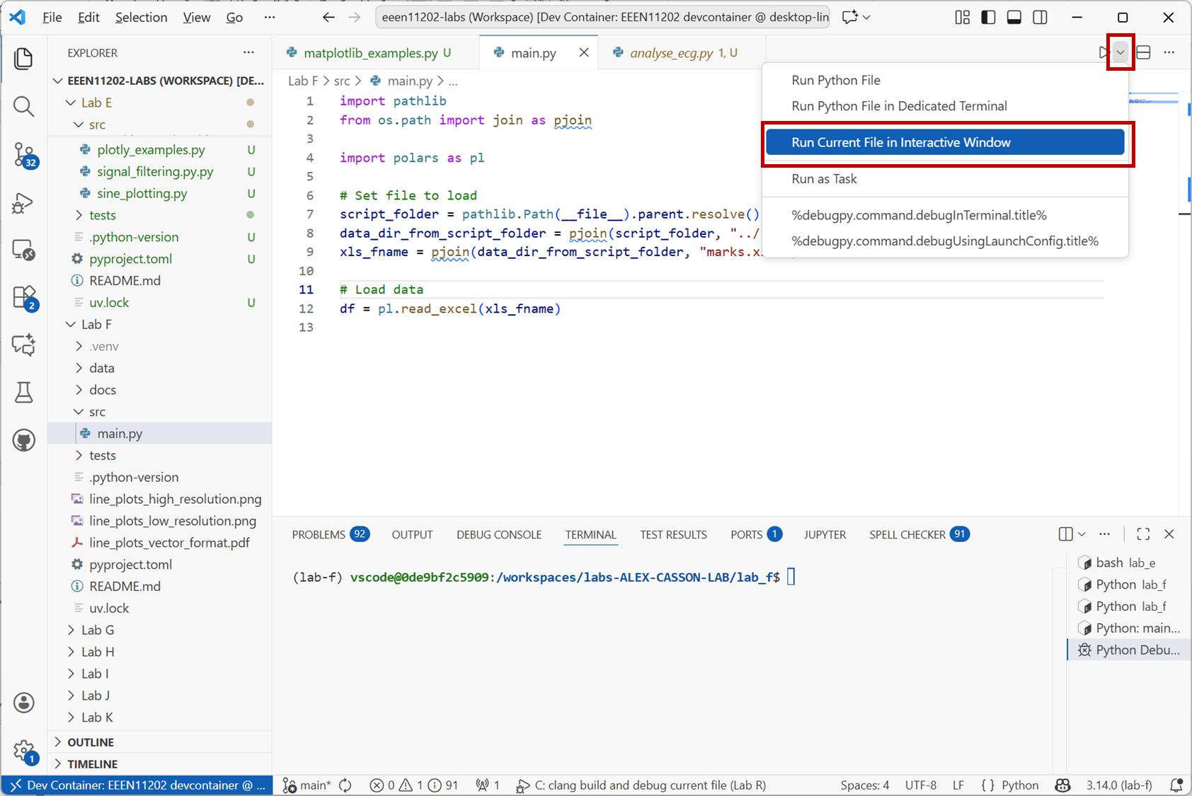
Screenshot of VSCode, software from Microsoft. See course copyright statement.
When the script has run, you’ll see a view similar to the one below. The dataframe is stored in an object called
df. Either enterprint(df)into the interactive window, or double click ondfin the variable explorer to see the contents of the dataframe.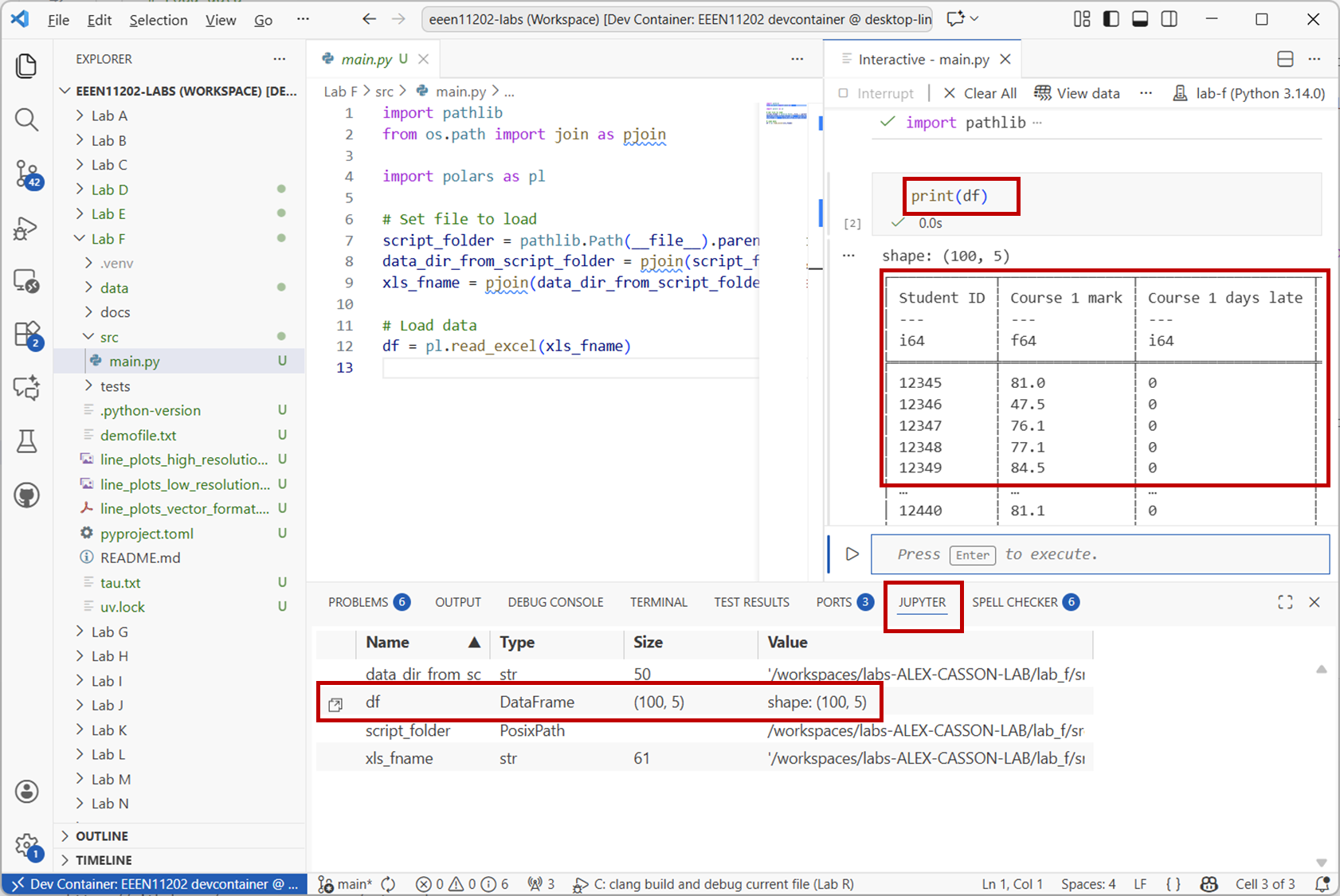
Screenshot of VSCode, software from Microsoft. See course copyright statement.
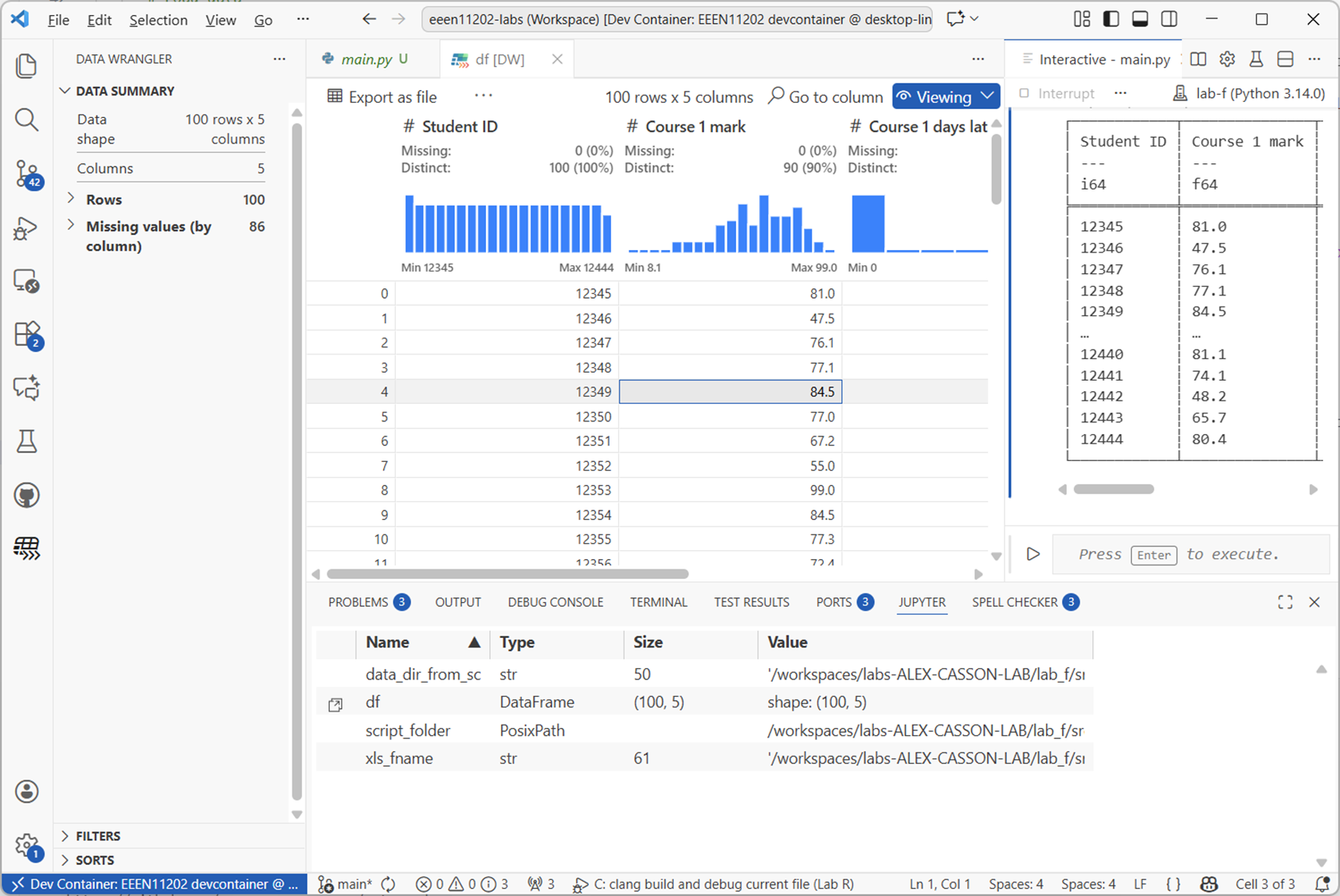
If using the graphical view (known as the data wrangler), your view will be like the below, where it’s automatically worked out some statistics and plotted histograms of the data columns.
Screenshot of VSCode, software from Microsoft. See course copyright statement.
4.3.2.1.2. Selecting data
Work through the examples below to get a feel for how to access data in a Polars dataframe.
To access a column of data you use the
.select()method. For example, to get theCourse 1 markcolumn:df.select(pl.col("Course 1 mark"))
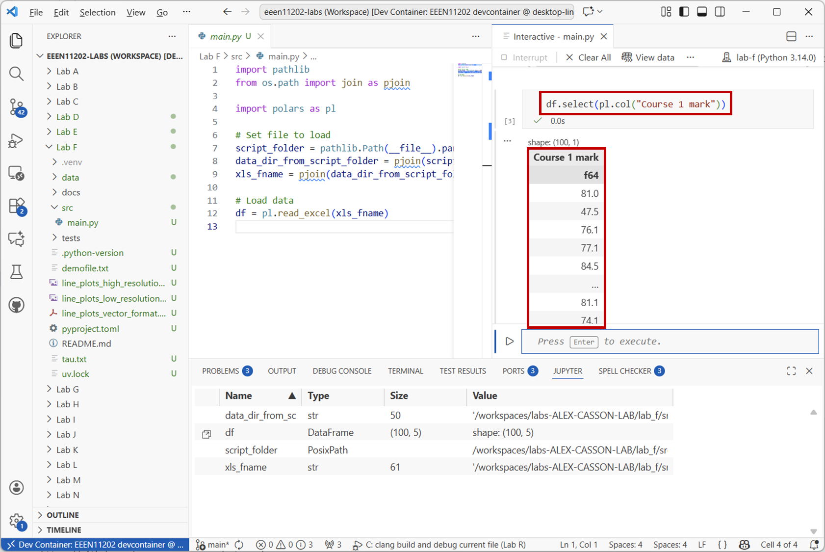
Screenshot of VSCode, software from Microsoft. See course copyright statement.
To access a row of data you use the
.filter()method. For example, to get the data for the student with ID12345:df.filter(pl.col("Student ID") == 12345)
You can do both of these at the same time. For example, to get the
Course 1 markfor the student with ID12345:df.filter(pl.col("Student ID") == 12345).select(pl.col("Course 1 mark"))
What did student
12437get forCourse 2 mark?Solution
38
df.filter(pl.col("Student ID") == 12437).select(pl.col("Course 2 mark"))
You can add conditions to the above. For example, to get the IDs for all students who failed Course 1 (i.e. got less than 40):
df.filter(pl.col("Course 1 mark") < 40).select(pl.col("Student ID"))
Again, you can combine this with other selections. For example to get the IDs of all students who failed both Course 1 and Course 2:
df.filter((pl.col("Course 1 mark") < 40) & (pl.col("Course 2 mark") < 40)).select(pl.col("Student ID"))
To get the student ID and the mark for those who failed:
df.filter((pl.col("Course 1 mark") < 40) & (pl.col("Course 2 mark") < 40)).select(pl.col("Student ID"), pl.col("Course 1 mark"), pl.col("Course 2 mark"))
You can also put the results into a new dataframe. For example, to get a dataframe of all the students who got a first in Course 1 (i.e. 70 or more):
firsts = df.filter(pl.col("Course 1 mark") >= 70).select(pl.col("Course 1 mark"))
How many students got a first in both Course 1 and Course 2?
Solution
17
firsts_both = df.filter((pl.col("Course 1 mark") >= 70) & (pl.col("Course 2 mark") >= 70)).select(pl.col("Student ID"))
print(firsts_both.height)
4.3.2.1.3. Operations
A wide range of operations are built in to polars, particularly for generating statistics about the data. For example, to get the mean and standard deviation of the marks in Course 1:
df.select(pl.col("Course 1 mark")).mean()
df.select(pl.col("Course 1 mark")).std()
What was the mean in Course 1 amongst students who got a first?
Solution
80.42
firsts.mean()
.with_columns()is used when we want to make changes to the dataframe.If you look at our dataframe more closely, you’ll see that there is also information on whether students submitted late, and so should receive a late penalty. For Course 1, this data has been filled in for every student. For Course 2, the data was left blank, unless the student submitted late. (If you load the
marks.xlsxfile into Excel you’ll see that many cells in this column have just been left blank.) It’s quite common to have missing data in datasets, where for whatever reason it’s not been filled in completely, or a measurement was missed.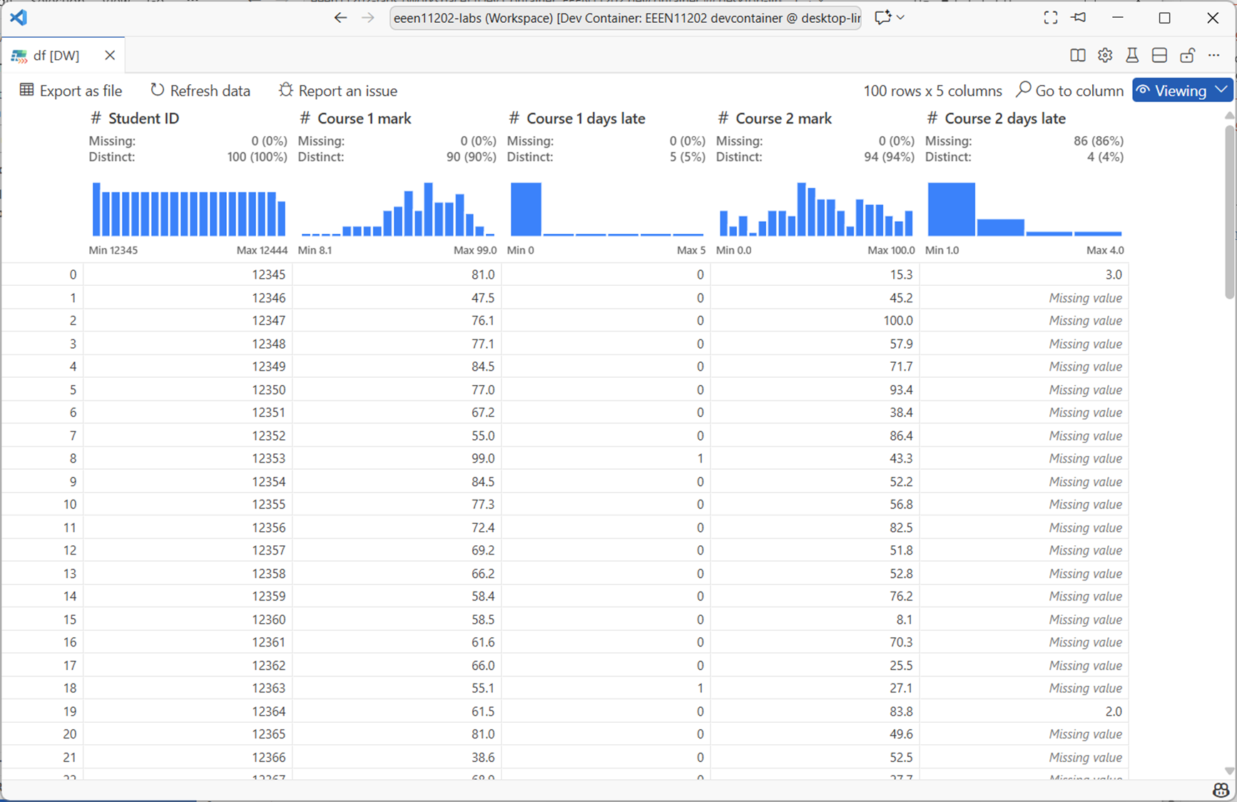
Screenshot of VSCode, software from Microsoft. See course copyright statement.
Here, the default number of days late is
0, i.e. on time. To fill in the missing data for Course 2 you can use:df = df.with_columns( pl.col("Course 2 days late").fill_null(0) )
This replaces the missing data in the
Course 2 late dayscolumn with0:Changing one value in the dataframe has a slightly complicated syntax. To set the mark of student 12345 for Course 1 to 100:
df = df.with_columns(
    pl.when(pl.col("Student ID") == 12345)
    .then(100)
    .otherwise(pl.col("Course 1 mark"))
    .alias("Course 1 mark")
)
This:
Uses
pl.when()to find the rows where the student ID is12345.Uses
.then()to set the value to100Uses
.otherwise()to leave all other rows unchanged by setting them to what is already inpl.col("Course 1 mark").Uses
.alias()to specify which column is being changed.
This same syntax can be used to make new columns. For example, to apply a 10% late penalty to students who submitted late for Course 2 and put this in a new column:
df = df.with_columns(
    pl.when(pl.col("Course 2 days late") > 0)
    .then(pl.col("Course 2 mark") * 0.9)
    .otherwise(pl.col("Course 2 mark"))
    .alias("Course 2 mark late penalty applied")
)
.alias()now contains the name of a new column that we want creating to put the result in.The actual University of Manchester late policy is that students receive a 10% reduction for every day a submission is late by. Write code to apply this late penalty to both courses, and to display the mean marks with and without the penalty.
Solution
# Apply late penalty
for course in [1, 2]:
    days_late = f"Course {course} days late"
    raw_mark = f"Course {course} mark"
    penalty_mark = f"Course {course} mark late penalty applied"
    df = df.with_columns(
        pl.when(pl.col(days_late) > 0)
        .then(pl.col(raw_mark) * (1 - (pl.col(days_late) * 0.1)))
        .otherwise(pl.col(raw_mark))
        .alias(penalty_mark)
    )
    print(df.select(pl.col(raw_mark)).mean())
    print(df.select(pl.col(penalty_mark)).mean())
.group_by()can be used to group data together. This is commonly used with.agg()(aggregate) to calculate statistics for different groups of data. For example, to get the mean mark for Course 1 grouped by the number of days late:df.group_by("Course 1 days late").agg(pl.col("Course 1 mark late penalty applied").mean())
4.3.2.2. A second example
The Lab F data folder also contains a file called choices.xlsx. This represents student responses for individual final year project choices:
Each project has a unique ID number. For example: Project 1: Design a heart rate estimation algorithm in Python.
There are a couple of hundred different project IDs.
Each student is asked to select 5 choices from the list of projects, giving projects that they would be happy to do.
They have to select 5 different projects.
Load the data into a polars dataframe, and then answer the following questions. The first one you should be able to do using only the notes above. The latter ones will require some external research and might be quite hard.
What did student mchabc80 select as their 3rd choice?
What was the most popular first choice project?
What was the most popular 5th choice project for students on the MEng course?
What was the most popular overall project (i.e. counting all choices)?
If the minimum project ID is 1 and the maximum is 208, which projects were not selected by any student?
How many (and which) students submitted the form more than once?
Optional challenge: How many students selected the same project for more than one of their 5 choices (which is against the rules)?
Solution
47
202
69
202
11, 19, 25, 43, 85, 89, 90, 95, 98, 99, 100, 101, 106, 107, 133, 142, 143, 159, 160, 161, 164, 171, 176, 181, 190, 198
Two students. mchabc82 and mchabc202
2 (we’ll leave the code for you to write for this one)
import pathlib
from os.path import join as pjoin

import numpy as np
import polars as pl

# Set file to load
script_folder = pathlib.Path(__file__).parent.resolve()
data_dir_from_script_folder = pjoin(script_folder, "../", "data")
xls_fname = pjoin(data_dir_from_script_folder, "choices.xlsx")

# Load data
df = pl.read_excel(xls_fname)

# What did student mchabc80 select as their 3rd choice?
stu = df.filter(pl.col("Username") == "mchabc80").select(pl.col("Answer 3"))
print(stu)

# What was the most popular first choice project?
mode1 = df.select(pl.col("Answer 1").mode().first())
print(mode1)

# What was the most popular first choice project for students on the MEng course?
df2 = df.filter(pl.col("Course").str.starts_with("M"))
mode2 = df2.select(pl.col("Answer 5").mode().first())
print(mode2)

# What was the most popular overall project (i.e. counting all choices)?
df3 = df.unpivot(
    on=["Answer 1", "Answer 2", "Answer 3", "Answer 4", "Answer 5"], index="Username"
)
mode3 = df3.select(pl.col("value").mode().first())
print(mode3)

# If the minimum project ID is 1 and the maximum is 208, which projects were not selected by any student?
unique_choices = df3.select(pl.col("value")).unique().to_numpy()
all_choices = np.arange(1, 209)
print(all_choices[~np.isin(all_choices, unique_choices)])

# How many (and which) submitted the form more than once?
df4 = df.filter(df.is_duplicated())
print(df4.select(pl.col("Username")).unique())
print(df4.select(pl.col("Username")).unique().height)
4.3.2.3. Time series data
Polars can load data from lots of different sources, not only Excel spreadsheets. In this last example though we’ll look at making a time series and putting this into a dataframe. We’ll use sine waves as a simple starting point, but these could be representing stock prices, energy usage in a building, or any data source that varies over time.
Note
For time series, Polars is probably at its best when the time stamp is clock time. That is, timestamps that represent a particular, unique, time and date. For example, a sensor reading recorded at exactly 10:04 pm on the 5th November 1955. This isn’t what we look at below, we start counting time from an arbitrary zero point. It doesn’t change anything that we’re going to look at, but might affect your decision on whether to use a dataframe for your own time series data.
Copy the code below into a new file and run it.
from datetime import time, timedelta

import numpy as np
import plotly.express as px
import polars as pl

# %% This is us making a simulated time series.
# Could imagine loading this in from a file instead, or downloading from the Internet

# Make sine waves in numpy
fs = 1000  # sampling frequency in Hz
f = 25  # Frequency of the sine wave
start = 0  # start time in seconds
stop = 10  # stop time in seconds
t = np.arange(start, stop + 1 / fs, 1 / fs)
v = np.sin(2 * np.pi * f * t)
v_noise = v + np.random.normal(0, 0.5, t.shape)

# Make time base
t = pl.time_range(
    start=time(second=start),
    end=time(second=stop),
    interval=timedelta(seconds=1 / fs),
    eager=True,
).alias("time")

# Make dataframe
df = pl.DataFrame([t, pl.Series("clean", v), pl.Series("noisy", v_noise)])
print(df)

# Plot
fig = px.line(df, x="time", y="clean").update_layout(yaxis_title="Voltage [V]")
fig.add_scatter(x=df["time"], y=df["noisy"], mode="lines", line=dict(dash="dash"))
fig.data[1].showlegend = False
fig.show()
This will produce an output like the below.
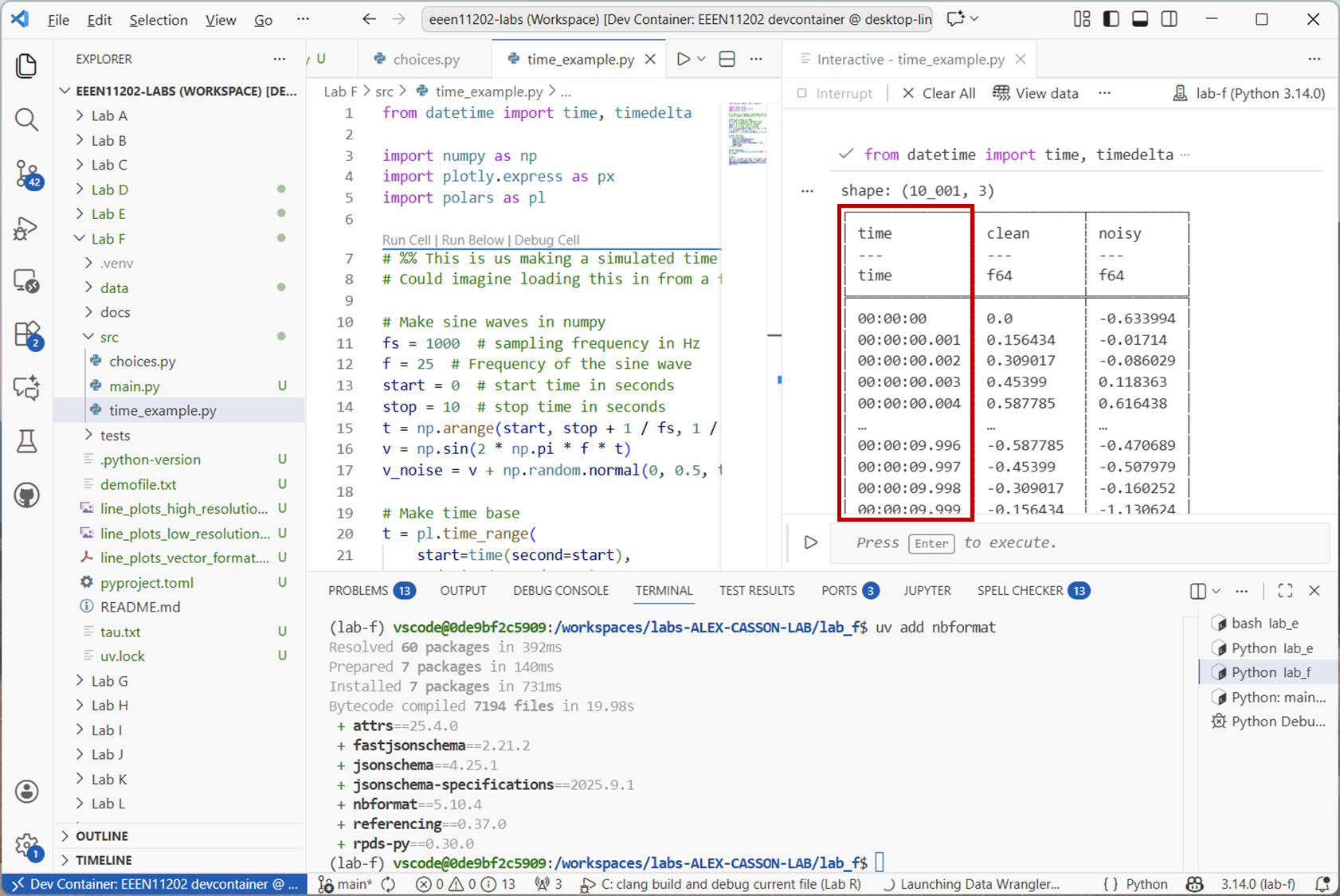
Screenshot of VSCode, software from Microsoft. See course copyright statement.
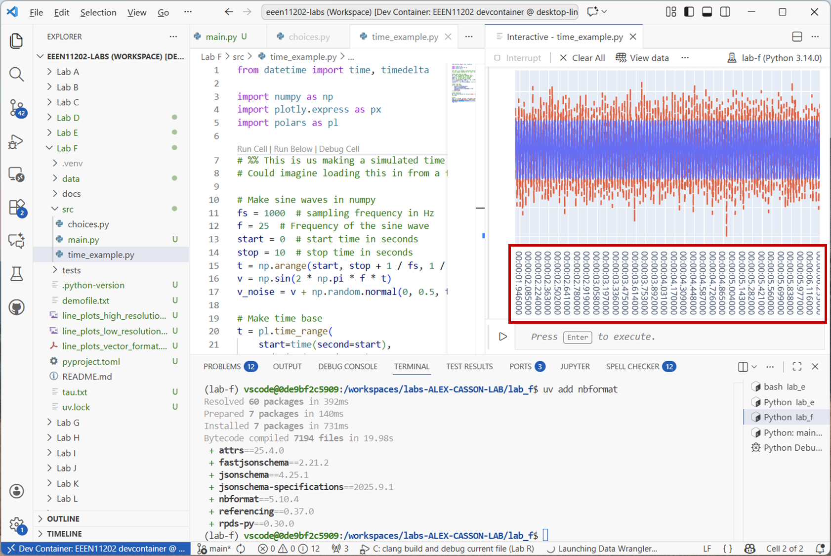
Screenshot of VSCode, software from Microsoft. See course copyright statement.
The dataframe is storing times as a datetime data type. This is quite a high time resolution time series, the sampling rate is 1000 Hz. Some time series might update much more slowly than this. For example, stock prices might update every second, some sensors take a reading once an hour or once a day.
For a simple time series like this, it’s probably not too important, other than that it’s now clear both
vandv_noisehave things happening at the same time points. For more complicated series, the sampling rate might not be a constant. Or, might be different for different sensors. Having a time column makes it clear when each measurement was taken.Polars provides a number of rolling functions for time series data, which apply to a window of data. For example, a moving average filter averages the points in a window to smooth out short term fluctuations. An 11 tap moving average filter can be applied with:
df = df.with_columns(pl.col("noisy").rolling_mean(window_size=11).alias("filtered"))

# Plot
fig.add_scatter(x=df["time"], y=df["filtered"], mode="lines", line=dict(dash="dot"))
fig.data[2].showlegend = False
fig.show()
This adds another column to the dataframe, now called
"filtered". The filtered signal will look like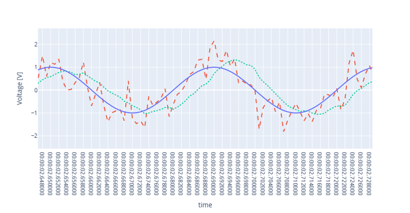
Screenshot of a web browser, software from Brave. See course copyright statement.
Try changing the
window_sizeparameter to see how this affects the filtering. What happens if you make it very small, e.g.3? What about very large, e.g.101?Solution
A very small window means that the signal isn’t smoothed very much. We need a good number of samples in order to be able to tell what the true underlying average actually is. Too many samples however, and we start averaging out the underlying sine wave. It has an average of zero, and so if we take a mean of lots of points, we end up with something close to zero.
There are a number of rolling functions available in polars. Using
.rolling_max(), find the maximum value of"noisy"in a 1 second moving window.Solution
secs = 1
window_size = fs * secs
df = df.with_columns(
    pl.col("noisy").rolling_max(window_size=window_size).alias("rolling max")
)
fig.add_scatter(
    x=df["time"], y=df["rolling max"], mode="lines", line=dict(dash="longdash")
)
fig.data[3].showlegend = False
fig.show()