4.1. Theory
4.1.1. Common external libraries
So far, we’ve mainly made use of Python’s standard library. This has lots of functions, but it’s also very common to use external libraries which have been written by other people and which don’t come bundled with Python by default. We’ve already used a number of these in different parts of the course, but haven’t looked at any in depth, other than pytest.
We’re going to briefly look at four common external libraries. Remember that most organizations will block arbitrary libraries from being installed on work computers for security reasons. The below are so common that they’ll probably be available everywhere, but they might not be.
We’re going to cover these libraries in the order below, split across two labs. It’s not quite ideal. For example, you often want to plot data to help explore it, but we need numpy to have some data to plot and so we need to cover numpy first. The plotting libraries work very well with Dataframes, but we need to cover Polars to introduce these and we want to do some plotting sooner than this. In a couple of cases, mainly around plotting, we might give some suggestions to look at the next topic before we’ve covered the current topic.
4.1.1.1. NumPy
NumPy is a library for numerical computing in Python. It provides lots of functions which are a bit similar to Matlab, which is still widely used in Engineering, but is a commercial product. We’re going to use numpy for signal and system modelling. We can create arrays that store models of sine waves, and other signals, and then perform operations on them.
4.1.1.2. SciPy
SciPy is a library which builds on numpy, and provides lots of additional functions for scientific computing. It includes functions for signal processing, statistics, and more.
4.1.1.3. Plotly and Matplotlib
We’ve already used plotly for plotting. Matplotlib is another library for creating graphs. We’re going to use both matplotlib and plotly. The exact split is probably one of personal preference. We’re going to use plotly for interactive plots, where we want to be able to zoom in and hover over points, and so on, and then matplotlib for plots we save to a file for putting into a report or into a presentation.
An important outcome from this course is being able to plot data using Python. When you get to your third year project, different supervisors might say different things, but for high quality plots I would expect most students to be producing them in Python rather than in other packages such as Excel.
4.1.1.4. Polars
Polars is a library for data manipulation and analysis. It provides Dataframe objects, which are a bit like a table in spreadsheet. Lots of operations that you might do by hand in, say, an Excel spreadsheet, can be done programmatically in Python by using Dataframes. We’ll use it for loading in data and then doing some analysis on this data.
Note
Pandas is another library for data manipulation and creating dataframes. It is extremely common.
We’re going to focus on Polars because:
It has a reputation for being faster than Pandas, especially for larger datasets.
It has a reputation for being easier to use, with a more consistent interface than Pandas.
Polars also supports Rust, and so we can use the same dataframes and interface with other high performance languages.
If you’re joining an existing project which already uses Pandas, or you’re using code from elsewhere which uses Pandas, essentially all of the concepts are the same as we’ll cover here with Polars, just with a different syntax.
4.1.2. Managing dependencies
There is nothing new this week about managing dependencies - we’ve already covered essentially everything when making a Python project Lab C. However, as we use more external libraries, managing dependencies becomes more important.
As a reminder:
We’re going to be using the
uvpackage manager. You might see examples online that usepiporcondato achieve the same thing, as (essentially) older approaches.uvis going to keep a record of our dependencies in a file calledpyproject.toml. You might see examples online that use a file calledrequirements.txtinstead, which is essentially an older way of doing the same thing. You might also see examples online which have no configuration file at all. This isn’t good practice unless your Python code is very simple. Remember, we need two things for our Python code to run: the Python code, and a virtual environment with all the required dependencies installed with the correct versions.
4.1.3. Plotting
Making a basic graph of data can be very easy. Making a good looking graph that highlights the key points you want to show, and is clear and easy to read, can be much more difficult. People have done lots of research into what makes a good visualization of data. Edward R. Tufte, “The Visual Display of Quantitative Information”, 1983, is a classic book on this topic if you want to read more. We’ll mainly focus on the practicalities of making plots in Python, but keep in mind that there is a lot more to making good plots than just knowing how to use the software.
4.1.3.1. Plot basics
The terminology of a making a graph is:
The basic unit of a graphics element is a figure.
A figure can contain one or more plots.
If there is more than one plot in figure, each is known as a subplot.
Each plot contains one or more axes.
Onto an axes we can display whatever graph we want.
These are illustrated on the figure below. In practice, you might find that the terms figure and plot are used interchangeably, and similarly axes and subplot used interchangeably. In each case, the name of a figure, or plot, or axes can be store in an object, so we can modify it later.
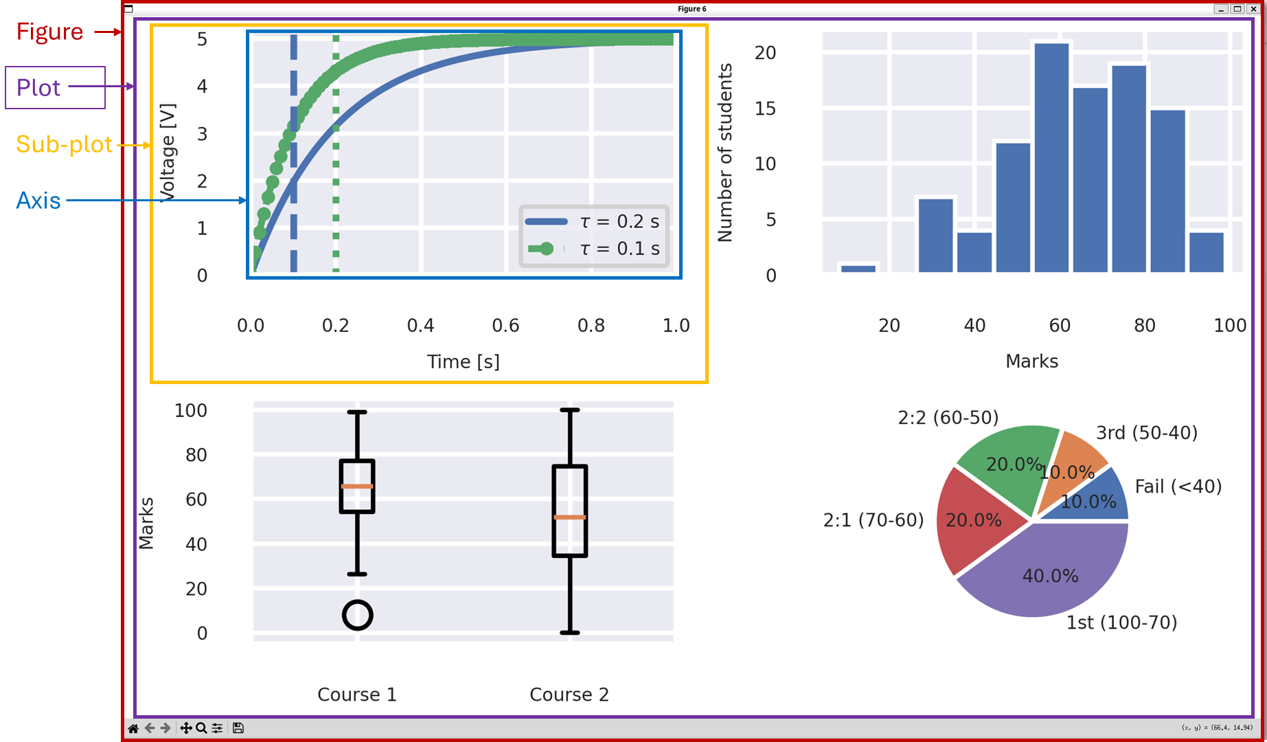
Screenshot of a figure made using matlplotlib.
4.1.3.2. Plot style guide
We’ve discussed our code style guide previously. There are also some common conventions for styling plots. In general, as electronic engineers we tend to follow the IEEE style.
Briefly we will use:
Label all axes clearly, including units where appropriate.
Units should be in square brackets, e.g.
Voltage [V].Do not include a title in the figure - this is usually redundant with the caption in the report or paper.
Ensure that different lines are differentiated by more than just color. For example, changing the color and the line style (solid, dashed, dotted etc.). This helps people with color blindness, and also helps if the figure is printed in black and white.
Include a legend if (and only if) there are multiple data series in the figure.
Use grid lines, but make them light and unobtrusive.
Use a sans-serif font such as Arial or Helvetica.
We strongly recommend being in the habit of always making sure axes are labelled on a graph. In (say) third year project meetings, a lot of time can be wasted trying to decipher what a graph is showing if axes are not labelled. It is a sure route to losing marks.
4.1.3.3. Plots for reports and presentations
As a last note, important to remember is that, by default, plots tend to be optimized for display on a screen and reading by the computer user. That is, for you to work with the plot to explore the data, such as zooming in and out on particular areas of interest, while sitting in front of a screen maybe 50 cm away. If you put a default style plot into a report, or presentation where you’re viewing it from several meters aways , the default plot settings will almost certainly be low resolution, and have axis labels that are too small to read.
We won’t go into the details of why we make some of recommendations below, but in general for good quality plots for reports and presentations:
Increase the default font size. On a screen, a good report font size will probably look a bit too big.
When possible, save the figure in a vector format such as in a
.svgor.pdffile. These can be scaled to any size without losing quality.Otherwise, save the figure in a
.pngfile. Do not use.jpgfiles for line art such as graphs.When saving a figure to a
.pngfile, set the resolution to be 600 dpi (dots per inch).